The Heat Map answers the question: Which monitored connections require the most urgent attention? The Heat Map organizes monitored connections based on the comparative number and severity of their alarms. Connections with the most alarms raised against them are given the most surface area.
The Heat Map is the first screen you see when you open Spotlight Cloud Mobile.
Tap on a connection to open the Spotlight Overview page for the connection.
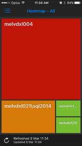
Color indicates alarm severity.
| Default Color | Severity | Description |
|---|---|---|
| Normal | No alarms are raised against this connection. | |
| Information | At least one information alarm is raised against this connection. No other alarms are raised. | |
| Low | At least one low severity alarm is raised against this connection. No high or medium severity alarms are raised. | |
| Medium | At least one medium severity alarm is raised against this connection. No high severity alarms are raised. | |
| High | At least one high severity alarm is raised against this connection. |