Baselining techniques are used to compare database performance over time. Compare data against baselines of earlier time periods. Determine if performance has improved or declined over time.
Note: Baselining is available for real time data and for viewing data in playback mode (Playback). Baselining is available for line charts. If the chart view is set to any other option (for example, pie, bar or area) then the baselining option will become unavailable. For more information, see Set the chart view.
To view the baseline chart
- Click Compare: Select time range.
-
Select from the available options:
- None - Clear the baselining display.
- 1 hour
- 2 hours
- 6 hours
- 12 hours
- 24 hours
The number of hours selected determines the time difference between the intervals of data used in the comparison. When set to 1 hour and the time on the chart reads 10:00 AM then data from 9:00 AM, 8:00 AM, 7:00 AM… is used in the comparison. When 24 hours is selected and the time on the chart reads 10:00 AM then data from 10:00 AM from the previous day and each day before is used in the comparison.
Up to 12 intervals of data are used. The number of intervals used depends on the amount of historical data available in the Playback Database. This number is displayed with the chart legend.
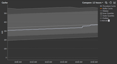
Baselining chart legend
| Icon | Option | Description |
|---|---|---|
| Data Series | The chart will have one or many mapped data series. The legend lists all the data series mapped to the chart. Baselining is calculated on one data series at a time. Click on a data series to select it. The selected data series is colored white. The data from the selected data series shows as a solid white line on the chart. Hover the mouse over a data series in the legend to view the current value for that series within the chart. |
|
| Median | The median is the middle value of the sampled data. The intervals of sampled data and the times when the samples are taken depends on the time range selected for the baseline plot. |
|
| Inner quartiles | The sampled data values closest to the median make up the inner quartiles. The inner quartiles represent half the sampled data values. The inner quartiles are calculated as per the inner quartiles of a box whiskers plot. | |
| Outer quartiles | The sampled data values furthest from the median make up the outer quartiles. The outer quartiles represent half the sampled data values. The outer quartiles are calculated as per the whiskers of a box whiskers plot. | |
| Outliers | The highest and lowest values from the sampled data make up the outliers. | |
| Intervals | The number of intervals is the number of sampled data values used to create the baseline chart. Up to 12 intervals are used dependent on the historical data available. Where 4 or more intervals are used a box whiskers plot is used to summarize the data. Where less than 4 intervals are used, lines are drawn for each baseline interval. Where there is insufficient data to plot the chart for the entire duration the chart will be plotted for the time that sufficient data is available. |
Tip: To enlarge the size of the baseline chart, right click the chart and select Maximize so the chart occupies the whole drilldown. For more information, see Maximize and restore charts.